By The Escalante Group
We know that the colors you choose for your home don’t just create a look — they shape how you feel every time you walk through the door. In Mansfield, where lifestyle, light, and community have their own character, using color psychology in home design can help you create rooms that feel calm, vibrant, cozy, or energizing depending on the purpose of the space. Whether you’re preparing your home for sale or updating a long‑loved space, understanding how color influences mood and perception can make all the difference.
Key Takeaways
- Color affects emotions, perceived space, and even behavior.
- Choosing the right palette for each room enhances comfort and flow.
- Thoughtful color use supports both everyday living and resale appeal.
What Is Color Psychology and Why It Matters
Color psychology is the study of how colors influence human emotions and behaviors. In home design, it’s not just about what looks pretty — it’s about how the color makes you feel when you’re in that room.
How Color Influences Mood
Common Reactions to Color
- Blues and Greens: Often create calm, restful feelings — ideal for bedrooms and quiet spaces.
- Warm Tones (Reds, Oranges): Energizing and social, great for dining areas or kitchens.
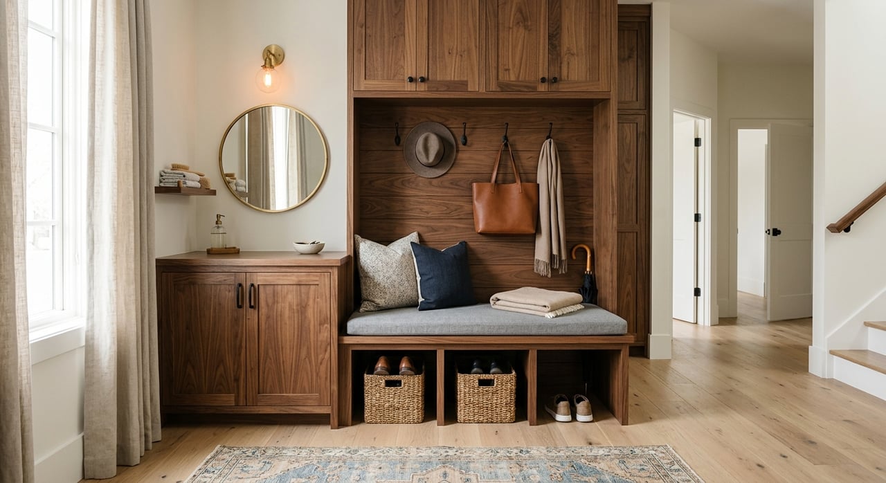
- Neutrals and Earth Tones: Offer versatility and grounding, perfect for living rooms or entryways.
- Bright Accents: Add personality and focus without overwhelming a space.
Understanding these reactions helps you choose hues that support the way you want to live and feel in each area of your home.
Room‑By‑Room Color Strategies
Each room has a purpose, and your color choices should reflect that purpose. What works in a bedroom might feel off in a home office or playroom.
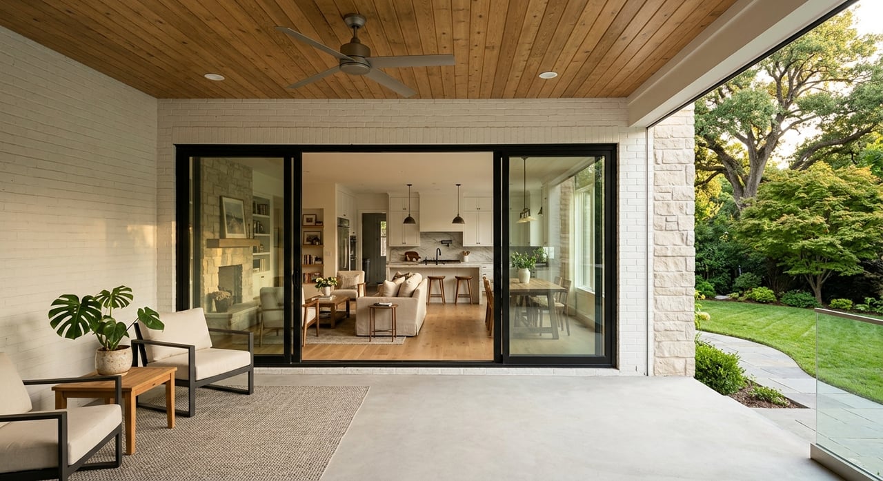
Living Room: Comfort and Connection
Colors That Encourage Togetherness
- Warm Neutrals: Soft beige, greige, and warm whites invite conversation and relaxation.
- Subtle Accents: Olive green or muted teal can add depth without distraction.
- Balance Light Levels: In north‑facing living rooms, warmer tones combat cool shadows.
In Mansfield homes, living rooms often serve as multifunctional spaces. Colors that feel balanced and welcoming help everyone feel at ease.
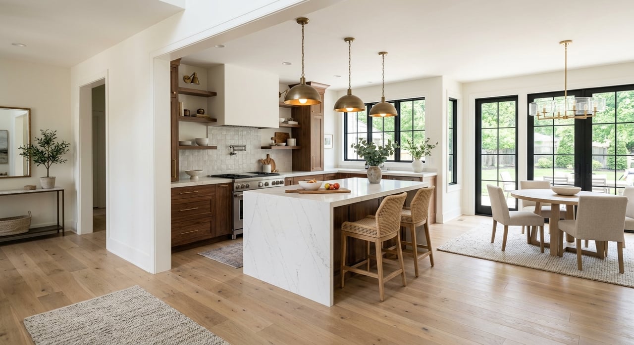
Kitchen and Dining: Energy and Appetite
Shades That Fuel Appetite and Social Energy
- Warm Reds and Terracottas: Can stimulate appetite and conversation.
- Creams and Soft Yellows: Brighten the space and pair well with natural wood finishes.
- Avoid Overly Dark Tones: In smaller dining areas, dark hues may close in the space.
Color choices in dining and kitchen areas set the tone for meals and gatherings, supporting warmth, energy, and connection.
Bedrooms: Calm and Restfulness
Colors That Promote Relaxation
- Soft Blues and Greens: Mimic nature and help lower stress.
- Cool Neutrals: Light gray or taupe complements restful lighting.
- Avoid Intense Brights: Loud colors can overstimulate and interfere with sleep cycles.
Bedrooms are retreats. Using colors that soothe helps promote better rest and a more restorative atmosphere.
Home Office: Focus and Productivity
Colors That Support Work and Creativity
- Light Blues and Greens: Encourage calm concentration.
- Accent Walls in Warm Tones: Subtle terracotta or muted mustard can boost creativity without distraction.
- Clean Whites or Light Neutrals: Offer clarity and reduce visual noise.
Your home office should feel motivating and organized, and the right color palette supports focus and efficiency.
How Light Affects Color Perception
Color doesn’t exist in a vacuum — light changes everything. The same hue can look completely different depending on daylight, direction of windows, and artificial lighting.
Matching Color to Lighting
Tips for Accurate Perception
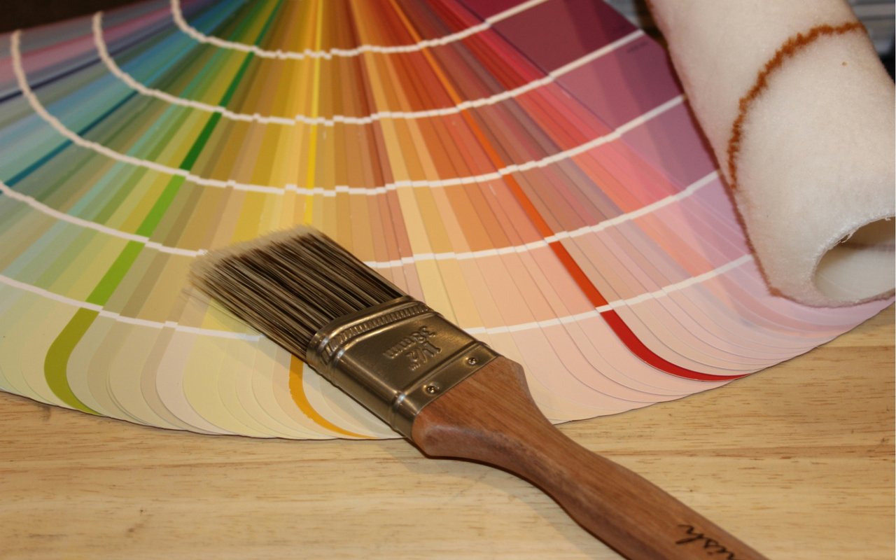
- Test Paint Samples: Apply swatches and observe them at different times of day.
- Consider Window Direction: South‑facing rooms get warmer light, which makes colors feel brighter.
- Choose Bulbs Wisely: Warm LED bulbs soften bright tones, while cool bulbs enhance crisp hues.
In Mansfield, where the natural light shifts with seasons, seeing colors in situ helps you avoid surprises once the room is fully painted.
Trim, Accent Walls, and Balance
Color psychology isn’t just about wall paint. Trim, ceilings, and accent walls play a big role in how a space feels.
Tips for Balance and Flow
Thoughtful Use of Detail
- Trim in Complementary Neutrals: Crisp whites or soft creams make colors feel intentional and polished.
- Accent Walls: A single wall in a bold or deeper shade adds focus without overwhelming the room.
- Ceilings: A slightly lighter shade than the walls can make rooms feel more expansive.
Design choices like these subtly influence flow and harmony throughout your home.
Color Trends vs. Timeless Choices
While trends come and go, thoughtful color psychology has staying power. Knowing when to embrace trends and when to stick to timeless palettes is key, especially if you’re preparing your Mansfield home for resale.
Balancing Style and Longevity
What to Consider
- Neutral Base with Accent Flexibility: Timeless walls with trendy accents allow easy updates.
- Stay True to Your Home’s Character: Colors should feel cohesive with architectural style and finishes.
- Market Neutral Doesn’t Mean Bland: Well‑selected neutrals can feel high‑end and inviting.
Trend‑inspired accents work best when anchored by a classic base that appeals to a broad range of buyers.
Common Color Mistakes and How to Avoid Them
Even well‑intentioned color choices can fall short without careful planning.
Pitfalls to Watch For
Mistakes That Derail Design
- Choosing Colors in Isolation: Always see how hues interact with furnishings and finishes.
- Ignoring Flow Between Rooms: Sudden, unrelated colors can make spaces feel disjointed.
- Overpowering Small Rooms: Dark or intense colors in small rooms can shrink visual space.
By looking at your home as a whole and considering function, flow, and light, you’ll make colors work smarter for you.
FAQs About Using Color in Home Design
How do I choose a starting color for my home?
Begin with a room you spend the most time in, then consider the mood you want — calm, energized, cozy — and select a color that supports that feeling. Test swatches in your lighting before committing.
Can color really affect my mood?
Yes; people often feel calmer in blues, warmer in reds and oranges, and more grounded in earth tones. That’s why color psychology matters when designing intentional spaces.
What if I’m nervous about bold colors?
Start with neutral walls and introduce bold colors through accents like pillows, rugs, or a single accent wall. You can always expand color use as you gain confidence.
Contact Us Today
Choosing colors that reflect your lifestyle and support your daily routines makes your home feel intentional and inviting. We’ve helped many Mansfield homeowners use color psychology in home design to transform their spaces with confidence, whether they’re updating for personal enjoyment or preparing for sale.
Reach out today and let’s talk about how the right palette can elevate your home. We’ll help you make choices that feel beautiful, functional, and uniquely you.